Every prompt in this collection so far has asked the model to do its best work. 4K. Crisp detail. Ultra-realistic. Sharp focus, editorial crisp, professional HDR, shot on a Sony FE lens.
This one asks for compression artifacts.
Read the bottom half of that. Intentionally lower resolution. Film noise. Slight blur. Minor motion blur, uneven exposure, flash hotspots. Not perfectly sharp. Slightly imperfect spacing like a casual photo dump. And then a negative list that rules out studio lighting, high-end polish, retouching and symmetry.
It is a specification for a worse photograph, written carefully, and it is the most interesting thing I have put in this collection.
The reason it works is that realism and quality point in opposite directions here. What gives a generated image away is almost never a missing detail — it is the absence of damage. Even lighting. Flawless skin. Every panel exposed the same. A grid whose gutters line up perfectly. Real phone photographs are none of those things: the flash blows out one shoulder, the third frame is a bit soft because someone moved, the grid is uneven because nobody measured it. To make an image read as real you have to ask the model to stop being good at its job.
This also explains something I only half noticed in the first post here. That prompt spent most of its length arguing the model out of studio polish — authentic spontaneous travel photograph, taken on a smartphone, no studio lighting — and I described it at the time as an argument with the model’s defaults. It was the same instinct as this one, just not yet organised. This prompt has turned it into a schema.
Two other things worth recording.
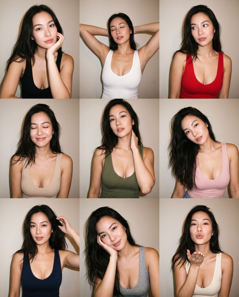
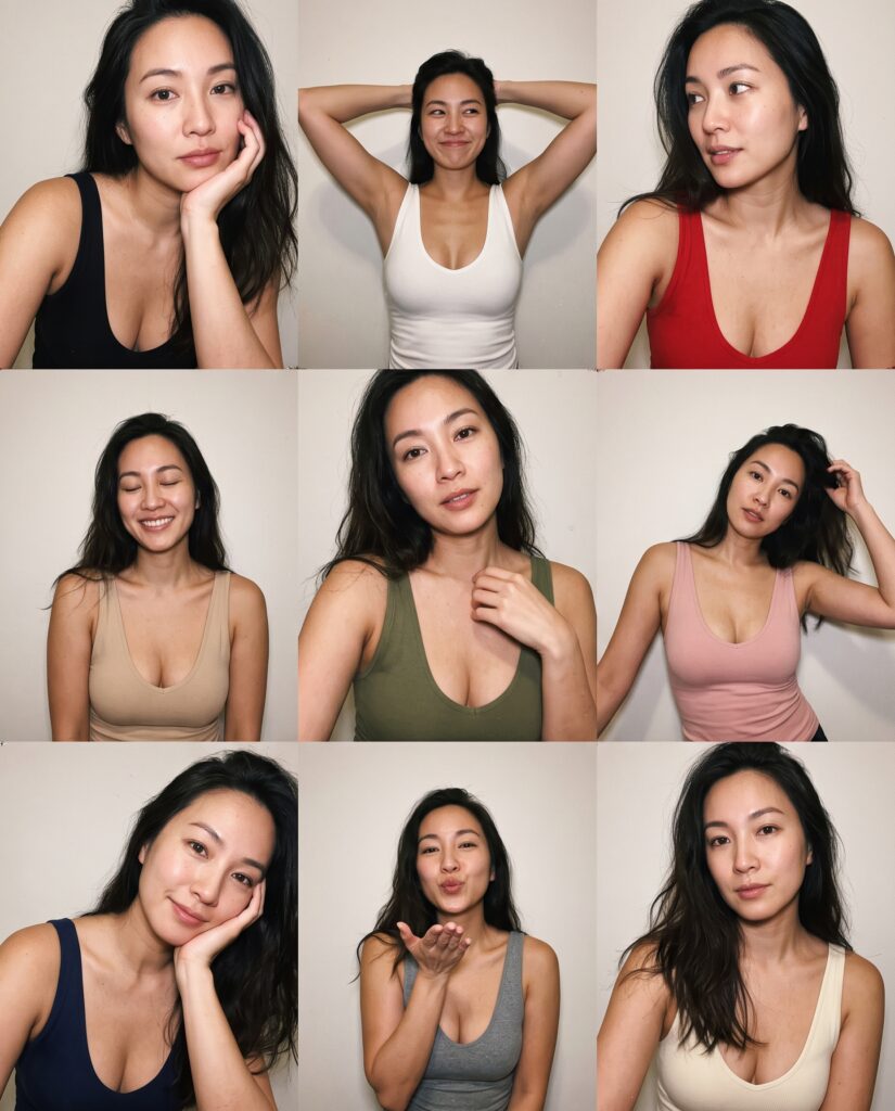
It never asks for a consistent face, and got one anyway. The character sheet prompt spent roughly a third of its length demanding identity consistency across panels, in three separate sections. This one does not mention it once — and both runs still hold one woman across all nine panels. But run one and run two are plainly different women. That is the real shape of the problem, and it is worth being precise about: consistency within a single generation is close to free, because the model is composing one image. Consistency across generations is the expensive one, and it is exactly what the character sheet existed to buy.
Enumerated lists get followed in order. Nine tank top colours are named — black, white, red, beige, olive, pink, navy, grey, cream — and both runs deliver all nine, reading left to right and top to bottom, in exactly that sequence. In the first run the nine poses map onto the nine panels in their listed order as well, chin-on-hand through to the blown kiss. The character sheet above behaved the same way with its view and expression lists. Prose gets interpreted; an enumerated list gets executed.