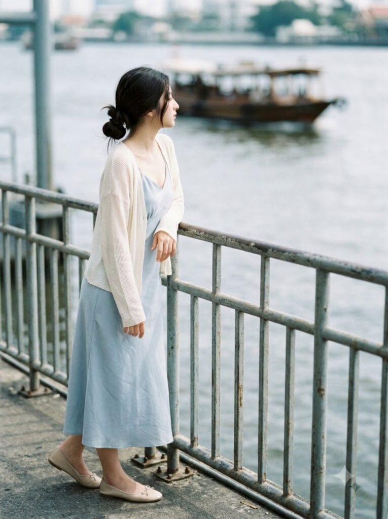
A 1990s Japanese photobook look on the Chao Phraya: pale-blue slip dress, ivory cardigan, a Helios 44-2 lens wide open. The file holds three prompts and the folder holds nine pictures. Three of them match a prompt.

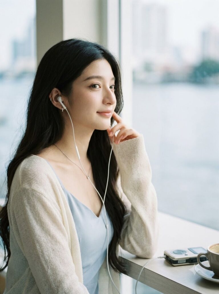
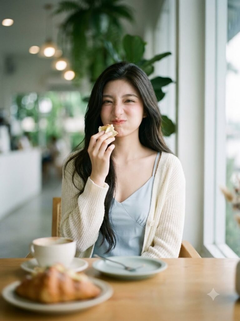
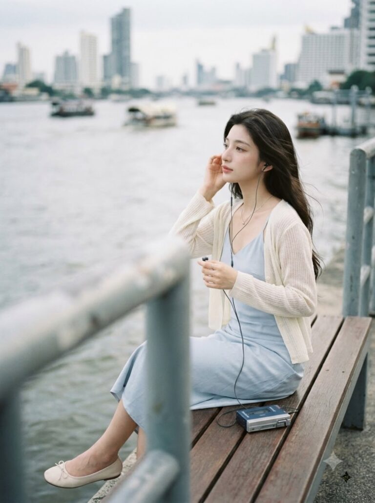
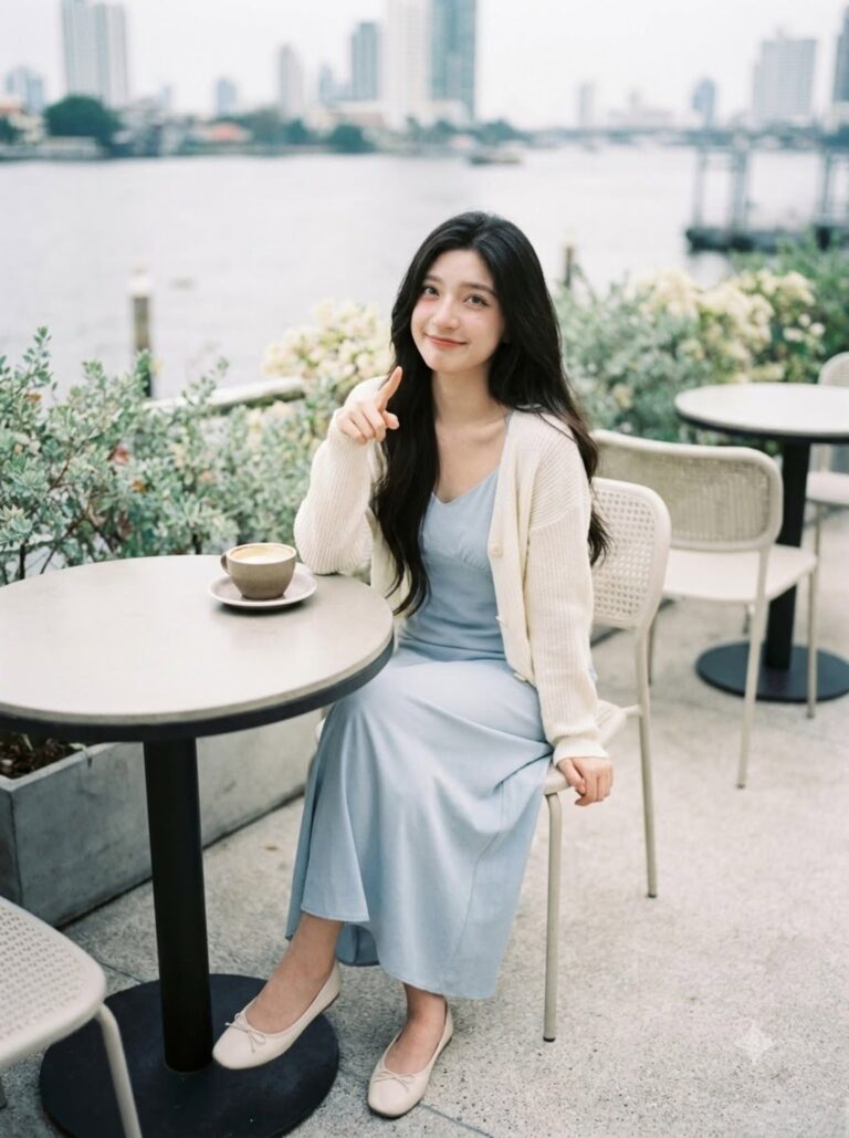
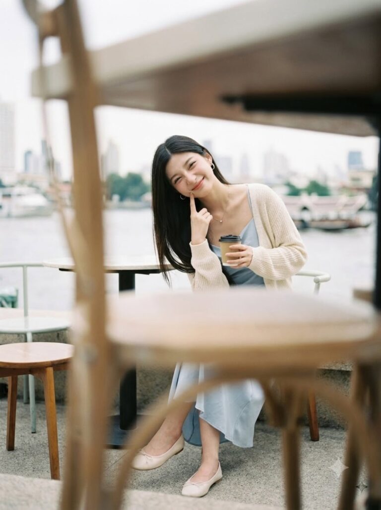
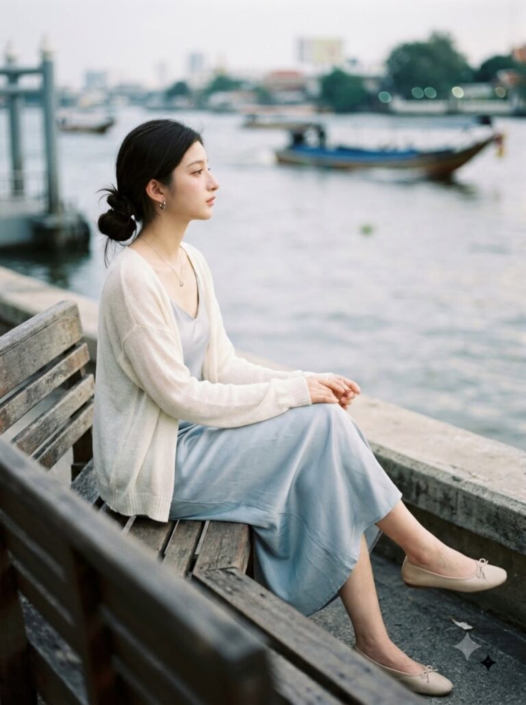
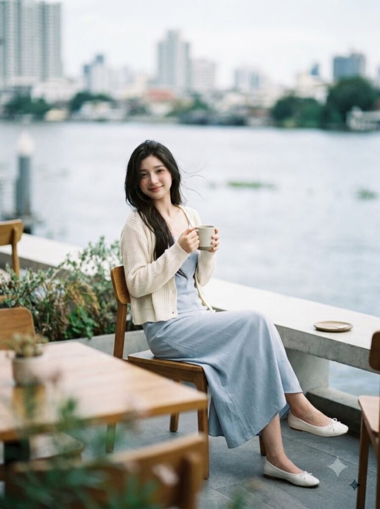
The three that match, match closely. Prompt one’s low bun and passing boat, prompt two’s long loose hair and coffee-plate-paperback still life, prompt three’s wired earphones with the cable running across the frame and the little player resting beside the cup. Each run took the props of its own paragraph and none of the others’.
The palette held across all nine, including the six with no prompt. Pale blue, ivory, faded grey, muted green, and no warm cast anywhere. All three prompts end on a list of what the colour must not be — no orange, no yellow cast, no golden-hour glow, no digital HDR — and nothing else in them asks for warmth. That is the kind of negative this collection says works: one nothing else in the prompt contradicts.
Ignored: EXTREME SHALLOW DEPTH OF FIELD, enormous soft circular highlights, in capitals, in all three. The backgrounds are soft, but the river, the boats and the skyline are still readable in every frame. Nothing dissolves into abstract shapes, and there isn’t a single round bokeh highlight in the set.
The sparkle is stamped twice on most of these — a large faint one with a small dark one beside it. As far as I can tell that means the picture went through the tool twice, which fits a set where six frames came from turns that weren’t saved.